Contemporary graphic design owes a great deal to the progressive artists of central Europe in the early 20th century. As Europe experienced turbulent times during this period, avant-garde artists in Austria between 1900 and 1937 were leading a creative renaissance, introducing design philosophies that set the standard for what is considered to be successful design today.

A sample of the Akzidenz Grotesk typeface.
When I studied graphic design at the Rochester Institute of Technology, I was heavily influenced by the design developments of this era. As we began designing the graphics for Glass of the Architects, Vienna: 1900–1937, I looked back on what I studied many years ago. I learned about German Gestalt Principles and how to achieve a “unified whole” and I studied typefaces such as Akzidenz-Grotesque, introduced in Berlin in 1898. I also learned about the Vienna Secession, the Wiener Werkstätte (Vienna Workshop), and their ideal for achieving a Gesamtkunstwerk (total work of art); their consistent focus on unification, consistency, and creating a complete package can be seen as precursors to what is known as modern-day branding.
An exhibition’s graphic identity visually represents the exhibition’s content and evokes memory and emotion. The team at the Museum worked with this exhibition’s designers, Selldorf Architects LLC, to pay homage to the architects of Austria in all aspects of the gallery. The graphics in this exhibition are based on the design of this region. Every choice, big and small, was thoughtfully considered beginning with the logo on the title wall, the black and white stripes wrapping the Dressing Room for a Star, and even to the typographic treatment on each label.

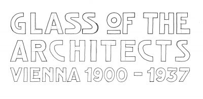
Glass of the Architects title wall design
We all found inspiration in the exquisite craftsmanship visible throughout the work from these artists. Personally, I fell in love with the handmade letterforms on the building signage at the Wiener Werkstätte, and the technical drawings for glassware by Josef Hoffman. I wanted our design to celebrate the beautiful imperfections only achieved by the work of human hands.
-
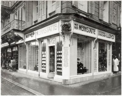
- Wiener Werkstätte store in Karlsbad (now Karlovy Vary in the Czech Republic), designed by Josef Hoffmann (1870–1956), in a photograph from 1909. © MAK.
-
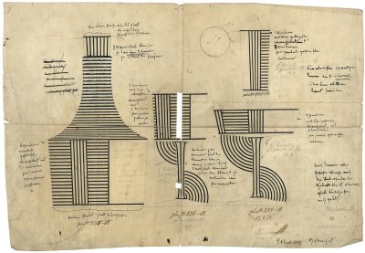
- Design Drawing for Glasses with Bronzite Decoration, 1911. Josef Hoffmann (Austrian, 1870–1956). Pen, color on paper. H. 30 cm, W. 40 cm. J. & L. LOBMEYR Family Collection, Vienna. © LOBMEYR; Image courtesy of J. & L. LOBMEYR, Vienna, Austria
Logo development for the exhibition began by stepping away from the computer and drawing each letterform on paper. After multiple progressions, I arrived at the final artwork that most closely replicates the signage produced by the Wiener Werkstätte. This process also inspired the black and white horizontal stripes that wrap around the reconstruction of the Dressing Room for a Star and lead guests into the gallery. To fully achieve a handmade aesthetic, both the logo and stripes in the exhibition were hand-painted by the local firm Pendelton’s Painting.
-
- Hand-drawn logo for Glass of the Architects.
-
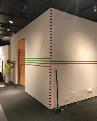
- Painting the wall stripes in the exhibition.
While the handmade approach is a fitting tie-in to the work in the exhibition, it would not be practical to employ it everywhere. For this reason, the design for the exhibition labels uses Akzidenz-Grotesk, a widely used and highly influential typeface of the period. The label text employs a rule-based design system, intended both to organize content, and to consistently repeat the horizontal lines through the gallery and create a unified whole.
A trip to The Corning Museum of Glass is an experience you will remember for many years to come. We invite you to see this exhibition for yourself and fall in love with Austrian glass just as we have.

Glass of the Architects, Vienna: 1900–1937, a cooperation of the MAK and LE STANZE DEL VETRO, is on view at The Corning Museum of Glass through January 7, 2019. Learn more about the exhibition.